
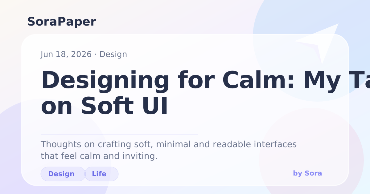
Soft interfaces work best when they are restrained. Rounded cards, gentle gradients and blur can create atmosphere, but they need strong spacing and contrast to stay usable.
What Matters
The most important details are usually quiet:
- Consistent corner radius.
- Low saturation accents.
- Shadows that suggest depth without floating away.
- Text contrast that remains readable in both light and dark modes.
A Small Rule
If an effect competes with the title or paragraph text, it should be reduced.